Harley Hospital
Our team partnered with Creative Navy, a London-based UX/UI design agency, to create a booking system for their client, a private healthcare company.
Outline
My team partnered with Creative Navy, who provided the information and objectives of their client. The client, a private healthcare company has been anonymised and is referred to here by the pseudonym ‘Harley Hospital’.
Company: Harley Hospital
Duration: 6 weeks
Role:
The team developed the booking system from the research stage through to a mid-fidelity prototype.
I conducted user interviews, user testing, developed the prototype for the home screen, booking history screens, and confirmation screens.
Project summary:
Harley Hospital had recently acquired 18 new clinics and wanted to rationalise their booking system. They decided to build an app that would allow clients to quickly book appointments at any of their sites.
The primary focus of the project was to develop a quick and easy to use booking system. A substantial part of the project focused on the filtering system through which the users could narrow their choice of site and doctor.
The first version, which used a single screen that would provide multiple options, focused on speed of use but did not work as desired in the usability testing.
We substantially reconfigured it in the next iteration to have a linear sequence of choices, creating a more straight-forward process, increased the task completion rate from 80% to 100% and improved the system usability score by from 75 to 95.

Client requirements
Harley Hospital had recently expanded by acquiring 18 new clinics, each of which has its own booking process. They wanted a booking system built from scratch that will be used across all of its existing and new clinics.
Their primary goals are to:
Allow users to book across any of their sites using the same app.
Speed up the booking process.
Present the company as a leader in digital access to healthcare.
Additional request:
Enable the user to book an appointment within 1 minute.
User interviews
We conducted interviews with 6 people, covering their experiences of booking systems, past use of private healthcare, and priorities when choosing healthcare providers.
Themes in the responses:
They would already have completed research before looking at the app.
They wanted to be able to choose their own doctor.
They valued being able to filter by closest clinic and doctor specialty.
A quick booking process was important. One interviewee specifically referenced liking the option for ‘first available appointment’ they had used previously.
They needed a clear confirmation email that included information on how to prepare for the appointment.

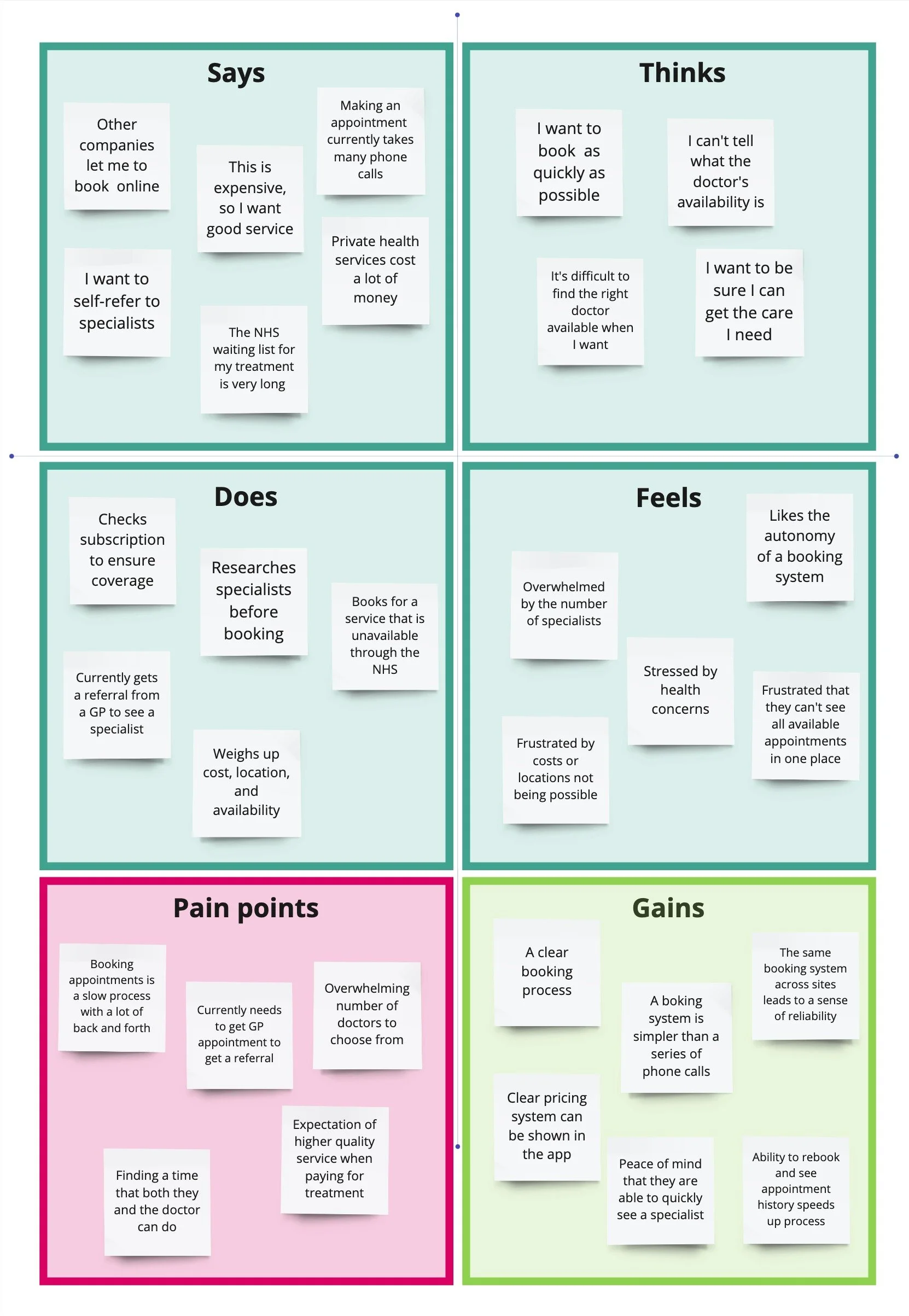
Empathy map
Based on these interviews, we produced this empathy map:
First design
Home Screen
The home screen was designed to enable the users to have a snapshot upcoming appointments and booking new ones.
Key features:
I focused on ensuring the user would be able to quickly access the information they would need when going to an appointment or checking their information. So the top part of the screen shows up to two upcoming appointments.
As client’s main reason for creating the app was to have a quick booking system, the ‘New appointment’ is in a central position and button very visible.
Additionally, users who were unsure of what they needed to do could quickly access guidance or go directly to book a GP.


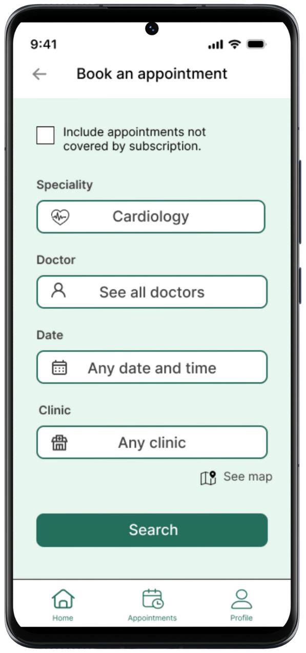
Filter screen
As users had expressed several factors that they considered important in how they chose their doctor, we designed the filter page to allow them to select as many core criteria as they wanted from the same page.
This was designed to take them straight to the most relevant results. The aim was to reduce the cognitive load of moving back and forth between screens and to reach Harley Hospital’s aim of having a very quick booking process.
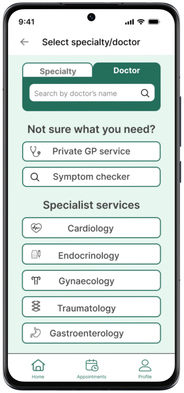
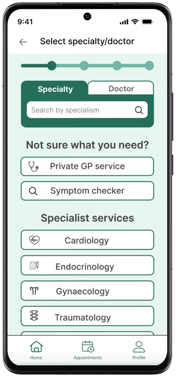
They could also search the system by doctor or specialty, or browse by specialty.
Doctors’ information
To give users both the ability to quickly browse physicians and the in-depth knowledge said they wanted during interviews, each doctor’s information was provided briefly on a card which provided access to detailed information.
I placed a ‘book appointment’ button on the card and at both the top and the bottom of the detailed description screen to allow the user to quickly progress through the process.


Appointment selection
To meet Harley Hospital’s requirement for a quick booking process and the concerns raised during user interviews about treatment costs and simplicity, we included:
The appointment duration
How much of the user’s subscription would be used or the up front cost
Potential additional costs
Information on the nearest possible appointment
The users could then scroll down to select a specific day and time.


Confirmation
The confirmation process included a step that would allow users to upload documents or photos and to write notes to their doctor.
As seeking medical care can often be stressful and feel as if a lot of things are out of your control, I wanted to ensure that the user had a sense of agency and participation in their healthcare.
This also gave the user the chance to make sure their doctor would be as prepared as possible for the appointment. This could help a user feel like they are getting better value for money, which could allay some of the fears about cost that were raised in the user interviews.


User testing
Results
The user testing was not as positive as hoped. While the system usability score (SUS) was 75, and therefore positive, the users were not able to complete all the tasks.
The tasks were:
Complete a new booking based on specialty.
75% completion rate
Average time of 4.5 mins to complete (Harley Hospital target = 1 minute)
To complete a new booking with a specific doctor.
88% completion rate
To book a second appointment with the same doctor.
75% completion rate
Conclusions
The filtering page was too complex and the users got stuck in a loop of changing the settings and reviewing the results.
The filtering page was not sufficiently differentiated from the page where the users initially make selections for different criteria.
The users became familiar with the system quickly.
They liked the confirmation system.
Second design
Redeveloped filter system
As a result of the feedback we received and the number of incomplete tasks during the user interviews, the second design of the system was substantially streamlined.
The process of selecting options was changed to a sequential series of screens. This led to a greater level of simplicity.

Updated screens
These screens show the simplified filtering screen and the addition of a progress bar to help the users see how far the are in the booking process.

User testing
The updated system led to a substantially improved SUS of 95 and a 100% completion rate of all tasks.
The time to completion for the first booking remained similar (at around 4.5 mins).
Next steps
There are 4 main areas that I would focus on for the next version of the app:
Further iterating the filtering system to improve the speed of booking.
Allow users to manage their subscription from within the app.
Consult medical staff about the lengths of appointments needed for different contexts.
Consider allowing users to add doctors to a favourites list.